UI: OneBusAway
For commuters, by commuters
OneBusAway is an open-source platform that provides real-time information for busses and public transit in Atlanta, Puget Sound, Tampa, York, New York City, and Rogue Valley, OR.
Originally developed by University of Washington students, the platform is carried on by developers and researchers across the nation. The mass of valuable information it provides users is a challenge to organize, and overall improvements in its user flow and visual design are needed.
Our group aimed to focus the app on the daily commuter who frequents the same bus stops and routes. Added features include the widget, bookmarks, and trip planning for commuters, by commuters.
Duration: 7 weeks
Programs: Sketch, Principle, InVision, Adobe Illustrator
Advisors: Karen Cheng, Audrey Desjardins
Winter 2017
Use the widget for quick access to bookmarked bus stops
View stop and route information on the timetable
Find the best bus route to your destination w/ trip planning
Process
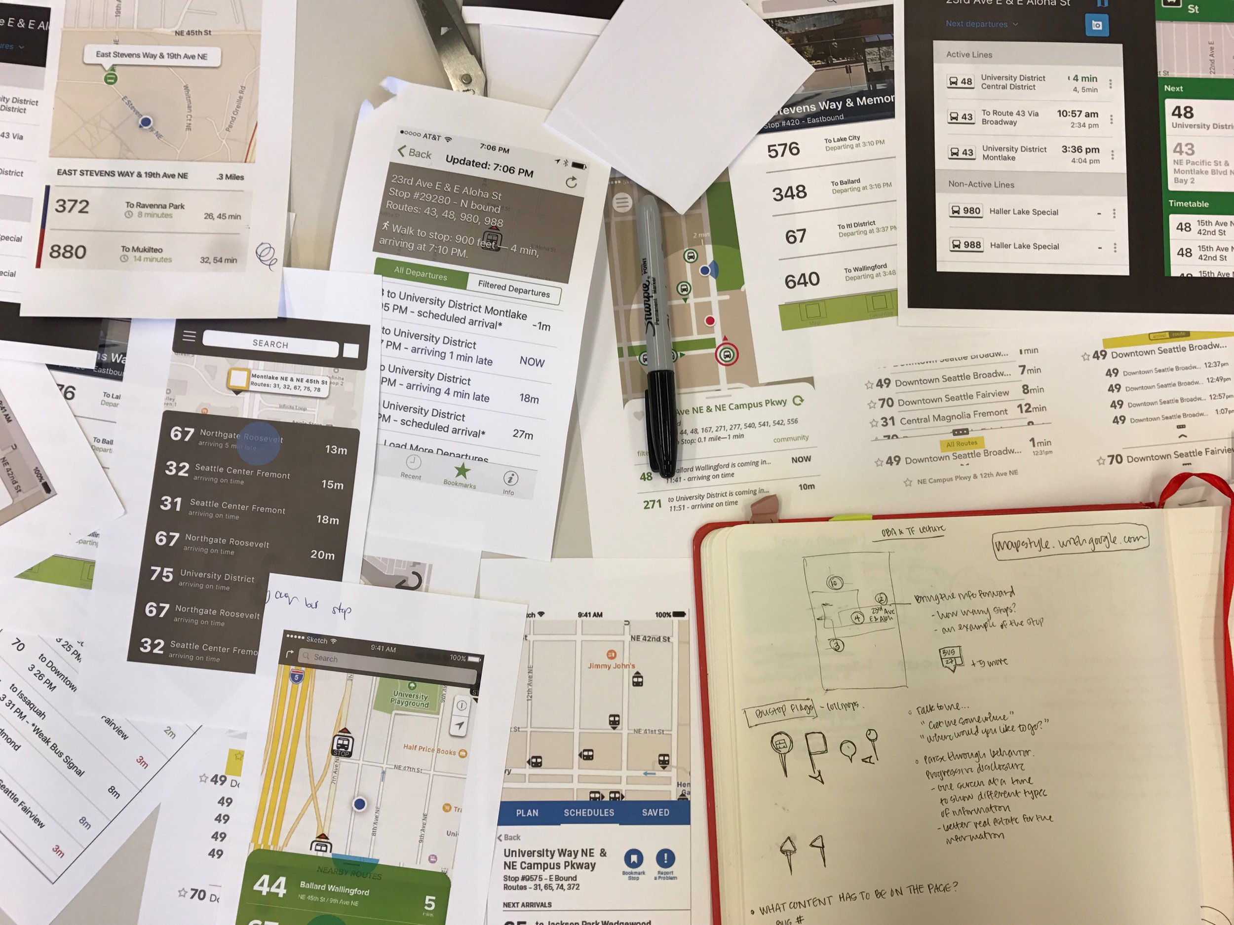
Our group began by researching and understanding the app, its primary function and user base. We met with the app's current contributors and developers and collected data via an online poll which received over 400 responses. From there we created a design brief and began to work on the following improvements:
add a trip planning feature
improve bookmark function
improve time tables (information hierarchy, typography)
show bus & current bus location
Current sitemap as of February 2017
We began the process of experimenting, testing, designing, and critiquing to come up with a new flow and visual system for OneBusAway. Over the course of three to four weeks we ran user tests and participated in class critiques until we were able to come to a cohesive resolution to the design brief.


